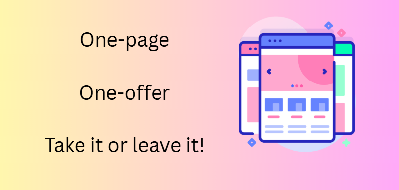
Ever seen those classic adverts – a one-page, one-offer landing page that offers you one thing, and one thing only? Like a 3-second tent or a drill bit that you can use for everything! Their very focused in what they offer, and they will only be of interest to a small niche audience – the people looking for the thing they sell.
If your website is like a busy high street shop window, full of colour, choice, and “come in and look around” energy, then a one-page, one-offer landing page is like a laser beam. It focuses every visitor’s attention on one thing, one decision, one outcome. And that is hopefully to buy what you are selling – be that a course, a book, a tent or a hammer!
In this article, we’ll look at the advantages of setting up at least a few of your offers on a standalone landing page, dedicated to guiding you audience through the buying process. We’ll also look at how you can make this work for you straight away, without the need to create a whole website, and the process of blogging to get traffic.
This isn’t about stripping your main website back to the bare bones. Your blog, shop, and About page still have their place. But if you want more conversions, adding a dedicated, distraction-free landing page for a single offer can work wonders.
Why too much choice kills conversions
Have you ever walked into a supermarket to buy toothpaste. You expect three or four options. Instead, you’re met with an entire aisle — whitening, charcoal, sensitive teeth, gum care, fresh breath, with fluoride, without fluoride, organic, kid-friendly, extra-strength, peppermint, spearmint, no flavour at all.
Instead of making a quick decision, you freeze. You pick one up, put it down, compare prices, and wonder if you should just come back later. You might even leave without buying anything at all if you’re anything like me,. I’d probably turn around, go to my local shop that only sells 2 brands – this one or that one!
The reason is we are overwhelmed by choice overload — and it happens online too. The more links, tabs, and options you give your visitor, the more likely they are to hesitate, click away, or “think about it later” (and never return).
A one-offer landing page removes every possible distraction and asks only one question: Do you want this, yes or no?
The psychology of one offer
When a visitor lands on your one-page offer, they see:
- Exactly what you’re selling
- Who it’s for
- What problem it solves
- How it works
- How to get it now
There’s no “About Me” rabbit hole, no unrelated freebies pulling them away. You control the journey from start to finish. You can add different layers to your funnel if you want to, add ons and extras, but be warned about these. Sometimes they can feel like the orignal offer was somehow not complete and they can annoy your audience. It’s the same with 30 minute video sells that never tell you the price until you’ve wasted 30 minutes of your precious time, only to find out you can’t afford it.
Think of the last time this happened to you – it’s not a pleasant experience and you are very unlikely to ever buy the product.
But there are ways that you can make one-offer landing pages work for your advantage and plenty of people who have used this method and succeeded.
Real-world proof it works
This approach isn’t theory — it’s proven to work if you know where to look.
- MasterClass sells all-access memberships via a dedicated single-page pitch. Visitors scroll through benefits, see testimonials, and click one big button to sign up
- Grammarly runs ads that send people to a single landing page highlighting one benefit — “Write Better” — with just two calls to action: Add to Browser or Sign Up
- Kit (email marketing software, formerly Convert Kit) often promotes new features through single campaign pages, even though they have a large, multi-section website. Many of their customers don’t own websites but simply create a landing page to direct people to their offer, or email sign up.
The principle is the same for a freelance designer with one package, a yoga teacher promoting a 30-day course, or a small SaaS app launching a single new tool.
It can do the heavy-lifting for you – explain the offer, build trust with testimonials, and act as a shop checkout if you add ordering and payment capabilities.
How to create a one-page, one-offer landing page
Think of it as your digital salesperson. It should answer every question in the right order:
- Headline – State the main benefit or result clearly
Example: “Launch Your Online Course in 30 Days — Even if You’ve Never Sold Online Before” - Opening hook – A short paragraph or question showing you understand the reader’s problem
Example: “You’ve got the content, the passion, and the drive — but setting up tech, sales pages, and payments keeps you stuck” - The promise – Describe what life looks like after they buy
Example: “In just four weeks, you’ll have a fully functioning online course, ready to enrol students” - Proof – Testimonials, screenshots, results, case studies
Example: “Maria launched her course to 47 paying students using this exact system. - Offer details – What’s included, how it works, and the price
- Call to action (CTA) – Keep it simple and repeat it. “Enrol now” or “Start free trial”
- Risk reversal – Guarantee or refund policy (if relevant)
- Urgency – Limited spaces, bonuses, or time-sensitive offers
You could even add a video or link to a YouTube video showing how it works or a testimonial. But remember that in my book, these are best if they give people the information they need sooner rather than later. There’s nothing wrong with giving the features and benefits of your product to whet the appetite and help nudge the customer into ‘buy’ mode. But there’s a point where it can get to feel like they are not treating you like an intelligent person who can make up their own mind, given the facts!
Step-by-step: building your first landing page
One of the advantages of using a simple landing page is that you can build it quickly, brand it with your logo and branding, and start promoting it on your social media pages right away. You don’t need to wait for the site and posts to get indexed or build site authority. And if you are marketing your links to the right people in the right places, you can pick up orders quickly too.
Here is a step-by-step process that you could adopt today!
- Pick your offer – It could be a product, service, course, or consultation. Make sure it’s specific and solves a clear problem
- Know and define your niche audience – This is important to know so you know where to market your link and ideas. And remember, niche and specific is better than too general. If you are targeting 40+ women who want to start yoga to gain more flexibility, that’s still potentially millions of people
- Choose a builder – Free or low-cost options include:
- Kit – Free landing pages and email sign-ups.
- Carrd – Very affordable, easy to customise.
- MailerLite – Email + landing pages in one.
- Write your content in a document first – Don’t design before you have the words. This will save you time, especially if you are not used to the way the platform you’ve chosen is set up.
- Add visuals – Use photos, short videos, or infographics to break up text
- Remove distractions – No menus, no unrelated links. Just the offer
- Test and tweak – Change headlines, images, or CTAs and see what works best
Remember, that there are also a plethora of AI tools on the market now that you can use for free to help you to write engaging content that will work for your audience. The trick here is to be specific with your prompts. Tell your AI assistant what your goals are, who your audience is and what you are hoping to achieve. That way, you will get a much more tailored response back. Don’t be afraid to have a conversation with your AI assistant either – they will answer your questions easily and fully.

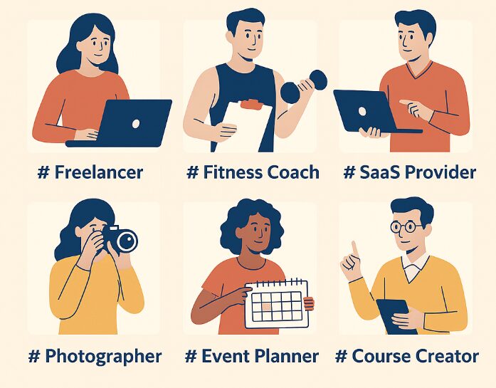
Who this works for
One-page landing sites work well for anyone who wants a functional page without the bother of building a website, or even if you have a site already, a focused landing page can add that extra push to get the sale. They can be particularly useful for:
- Coaches & consultants – One coaching package per landing page
- E-commerce sellers – Promote one best-selling product or seasonal special
- Service providers – Feature one high-value package (e.g., “Full Branding Package”)
- Online educators – Focus on one course at a time
Why a landing page might not convert
Everything is not all rainbows and roses in the world of digital marketing, and there are times when even your best efforts fall short. This is likely due to:
- Unclear offer – Visitors don’t know what’s being sold
- Too much text before the benefit – Lead with the result, not your life story
- No trust signals – Add testimonials, security badges, or guarantees
- Weak CTA – Make it visible, repeat it, and use action words
- Too long introductions and waffle – These can just send your potential customer running for the hills!
The beauty of a one-page site, though, is that you can track your conversions and tweak things as you go. Ask for feedback from trusted people or a focus group, and don’t be afraid to test things out to see what’s working best.
A one-page, one-offer landing page is not about limiting your business — it’s about focusing it. You can have a full website for your brand, but when it comes to turning interest into action, clarity sells.
Give your visitors one thing to say “yes” to, and you’ll often find that’s all they need.
Related posts
How to build a beginner marketing funnel
How to use AI to build an online business
Personal branding for your online business
Thank you for creating this post!
I have been contemplating on what I can feature on my online business that will allow me some visitors as well as customers however unsure of where to start. This is a great thought and certainly seems like will lead to more conversions on ones site.
Appreciate you taking your time to create such a post, have a great day!
Hi Sariya. Thanks for taking the time to read the article and leave your comments. I’m so pleased that you found it useful. I think that oneline business can get a little confused nowadays and sometimes it’s best to start simply and build from there. All the best with your own business. Let me know how it goes. Gail
This article is a fantastic reminder of the power of simplicity in landing page design. By focusing on a single offer and keeping the message clear, concise, and conversion-driven, you avoid overwhelming visitors and instead guide them gently toward one action—making that step feel natural, not forced. It’s a strategy supported by many expert sources, including those who stress the importance of a single, strong call-to-action and consistent messaging between ads, pages, “CXL”, “Unbounce”, and “The Spot.”
What stands out even more here is how this focused approach aligns with broader best practices: uncluttered layouts, clear benefit-driven headlines, trust elements, and minimal distractions CXLStellar. It’s amazing how these simple principles, used consistently, can meaningfully boost conversions.
I’d love to hear your take: Have you found one particular design element, like a bold headline or high-contrast CTA placement, to be more effective than others in keeping visitors focused and converting on that one offer?
Hi Leahrae. Thank you for your kind comments about my article and I’m glad you found it useful and enlightening. I’m pleased too that you found it in keeping with some other platforms that promote something similar. To answer your question, I have not yet discovered anything that I could lay my hand on my heart and swear that was the ‘magic bullet’ to get conversions, but one tool I have discovered, is Bing’s Clarity tool that you can find on Bing Webmaster Tools. If you link your website or landing page to that, then you can see what visitors to the site read and click on, how far into the article they read, etc, and I think that will give more useful data over time in discerning what is and what is not working.